|
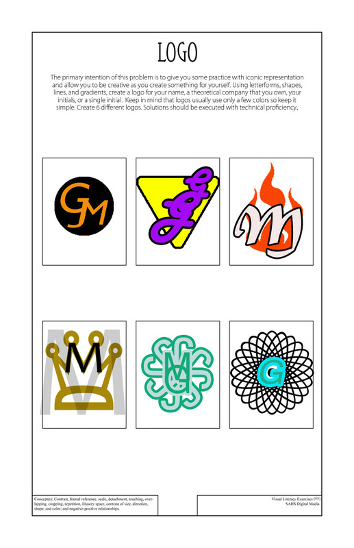
Fake Company Logos This project was one of the more directly applicable uses of graphic design. All companies have logos, so taking some time to make some simple ones in Photoshop is good practice of creating effective media. I like symmetry, so a lot of the design decisions involved making my logos symmetrical (especially the bottom row.) The other logos required careful use of proximity to create something cool-looking. The graphics on some of the logos combined to create a distinct, creative shape, but some of the other logos turned out pretty bland and unmemorable. I liked this project because it was and short and sweet while still allowing for limitless possibilities. |
