Quote Poster
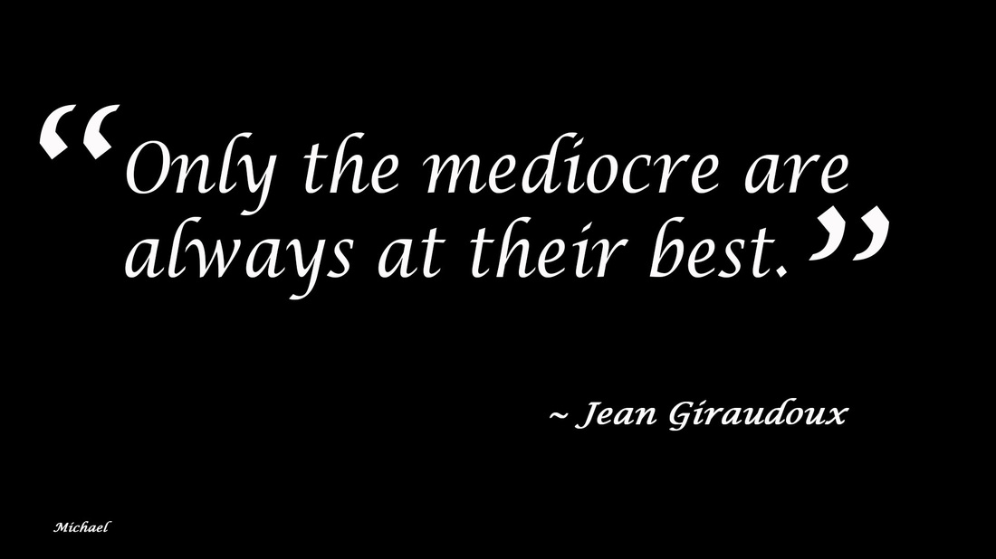
The simplicity of the project makes it seem like not very much went into it, but the CRAP principles and design with type skills are on full display. It’s not like I didn’t have these skills before, but I think this is one of the only projects where the CRAP principles were so obviously on display that it would have actually looked bland and terrible without them. The quotation marks are large so that it is evident that the words are part of a quote; the words in between the quotation marks had to be much larger than the other words because they were most important; the quote, attribution, and name were all flushed differently to show their independence of one another. These combined to make the quote stand out and inspire. Personally, I thought this project was a little on the boring side, but it was definitely good CRAP practice.
The simplicity of the project makes it seem like not very much went into it, but the CRAP principles and design with type skills are on full display. It’s not like I didn’t have these skills before, but I think this is one of the only projects where the CRAP principles were so obviously on display that it would have actually looked bland and terrible without them. The quotation marks are large so that it is evident that the words are part of a quote; the words in between the quotation marks had to be much larger than the other words because they were most important; the quote, attribution, and name were all flushed differently to show their independence of one another. These combined to make the quote stand out and inspire. Personally, I thought this project was a little on the boring side, but it was definitely good CRAP practice.
