|
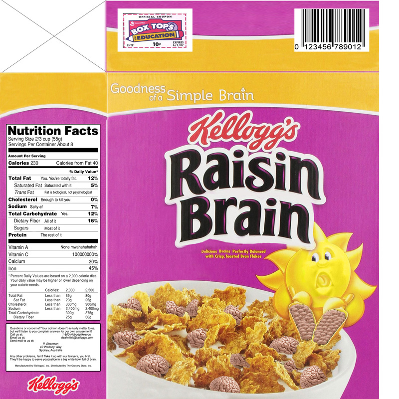
Unsuccessful Breakfast Cereal
This project was a demonstration of almost every Photoshop skill I learned and improved on throughout the class: selections, layer masking, clone stamping, and healing brushes, among others. I think the most important design decisions I made on this project was establishing uniformity among all the panels of the cereal box. I stamped out a lot of extra features from the original image of the box and then copied the design from the front onto the side and top to create repetition. The graphics and texts effectively combined to make a completely unappealing food product that no one in their right mind would ever b. Much like with the Animal Album Art, I think the open-endedness of this project made it a great test of creativity as well as of design abilities. |
